A New Reporting Engine for Purple+: What We Are Building
We are rebuilding the Purple+ reporting experience from the ground up. A native reporting engine inside the desktop app, designed for supervisors who need answers fast. Here is what is coming.
Why we are rebuilding reporting
Purple+ already has reporting. It works through the management portal and covers the basics: inbound and outbound call counts, answered and missed calls, calls-per-hour charts, calls-per-agent breakdowns, and SLA overviews. For many teams, this does the job.
But we keep hearing the same feedback. Supervisors want to drill down from a number to the actual calls behind it. They want to compare queues side by side. They want to answer "why were calls missed?" without exporting data to Excel. And they want to do it without switching between the desktop app and a browser.
That is why we are building a completely new reporting engine, native inside the Purple+ desktop application.
What the new reporting engine looks like
The new engine is not a web page. It is a native module inside Purple+, sitting right next to your calls, chat, and contacts. Click the Reports tab and your data is there. No separate login, no browser, no context switching.
Every screen is designed for supervisors who need to make decisions based on what is happening right now. The interface follows the same Teams-inspired design as the rest of Purple+, so there is nothing new to learn.
Overview dashboard: the full picture in one glance
The overview dashboard shows six key performance indicators at the top: total inbound calls, answered calls, missed calls, answer rate percentage, average call duration, and transfers. Each tile is color-coded and clickable. Tap "Missed" and you jump straight to the call log filtered to missed calls. No hunting through menus.
Below the KPIs, a queue health grid shows every queue in your contact center with its answer rate and SLA status. Green means healthy. Red means attention needed. You can spot problems across all queues in a single scan, then click into any queue for the full breakdown.
Queue detail: drill down to what matters
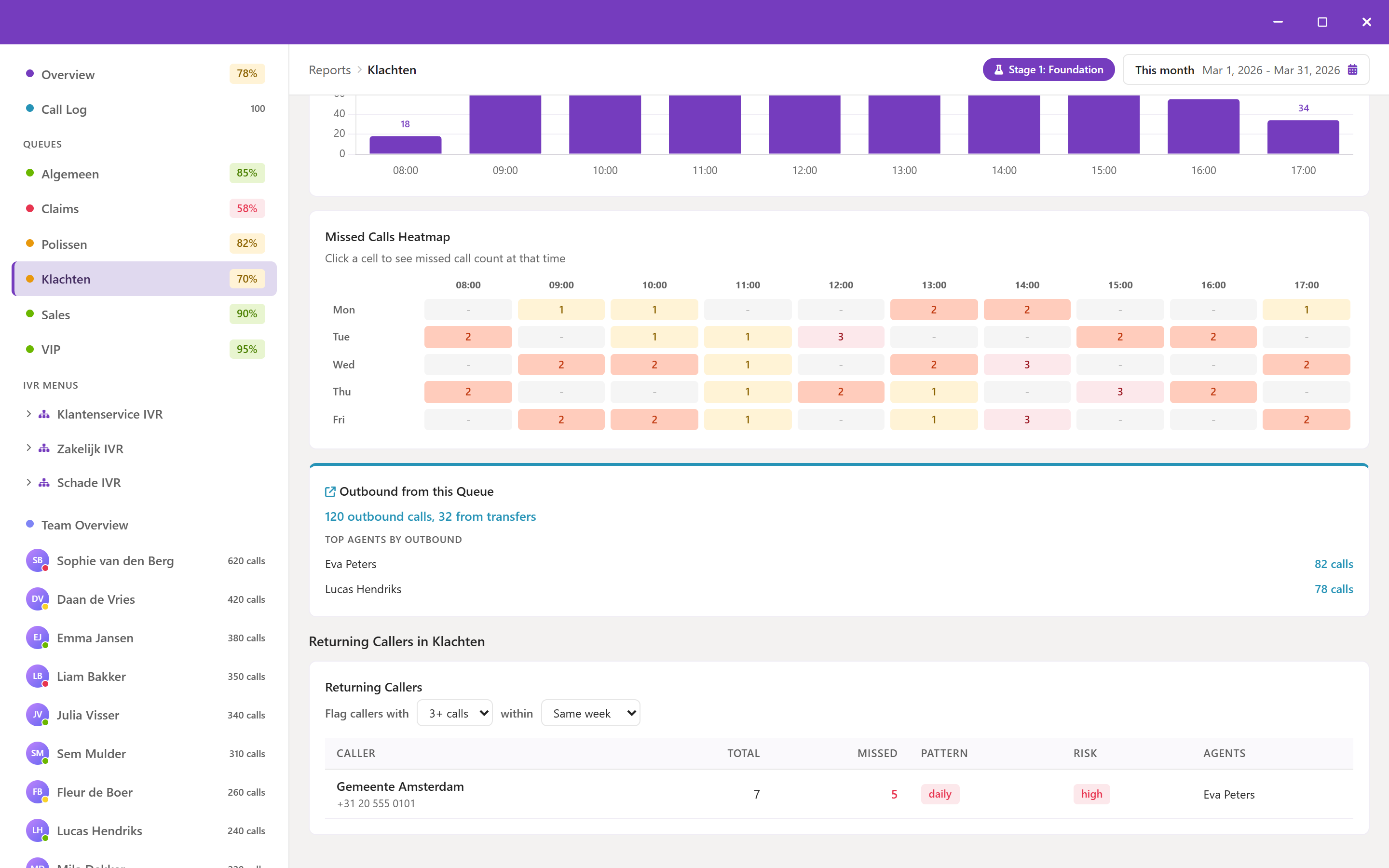
Select any queue and you get its dedicated detail view: the same KPI tiles filtered to that queue, an SLA progress bar showing target versus actual performance, a monthly trend chart, hourly call distribution, and an agent breakdown table showing who handled what.
For organizations using IVR menus, the reporting engine shows the full IVR structure: parent menu, branches, and per-branch call volumes. You see exactly how callers navigate your menu and which options drive the most traffic.
Agent performance at a glance
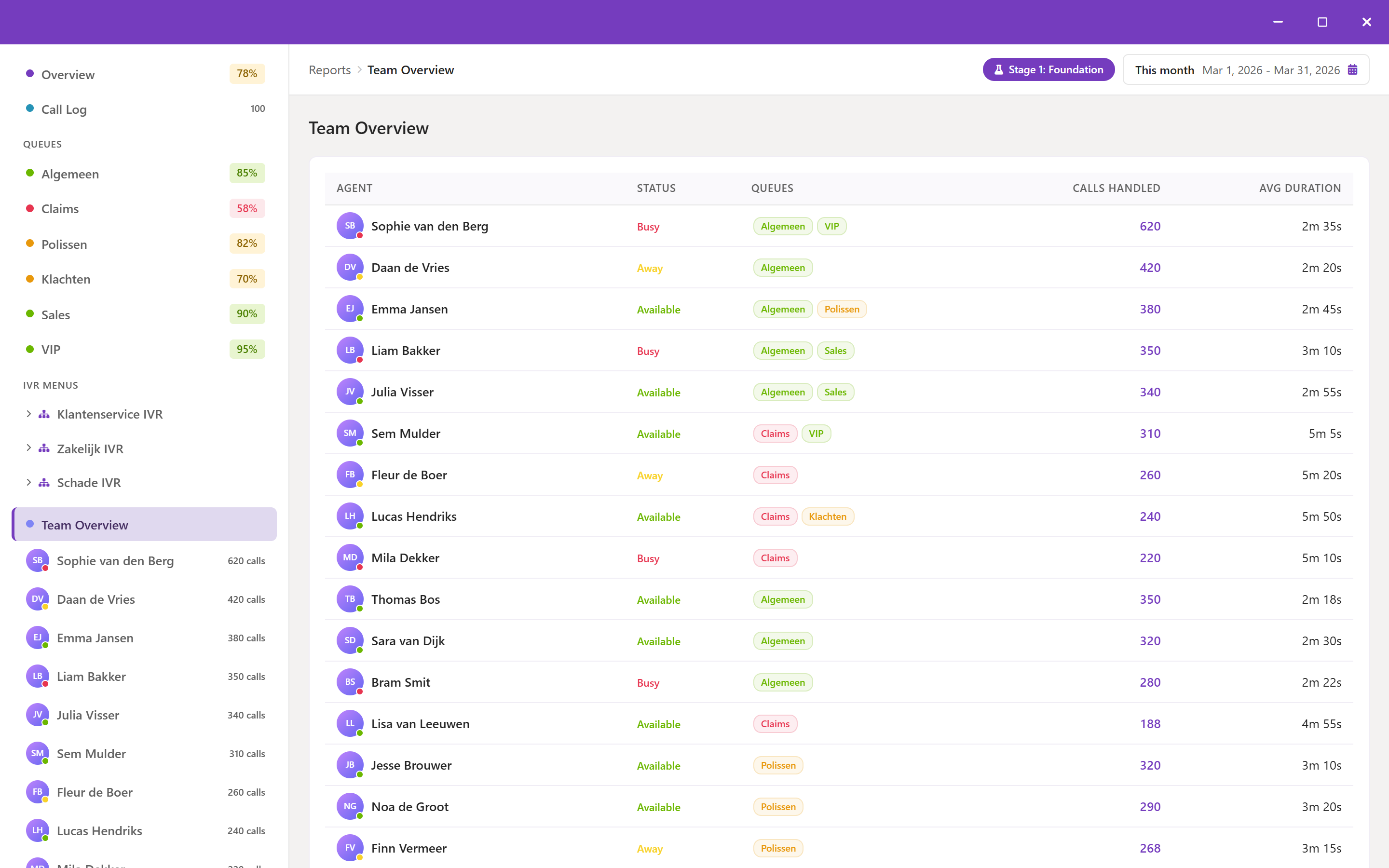
The team overview shows every agent in a sortable table: calls answered, calls missed, total duration, average duration, and hunt rate. Click any agent to see their individual detail page with a comparison against team averages. Supervisors see exactly who is performing well and who might need coaching, backed by data instead of assumptions.
A presence timeline shows each agent's availability throughout the day. Green for available, red for busy, yellow for away, grey for offline. This makes shift coverage gaps visible at a glance.
Call log: one source of truth
Every number in the reporting engine is backed by actual call records. The call log is a paginated, filterable view of every call that came through your contact center. You can filter by date range, caller, agent, queue, and call status. Search for a specific caller number and see their complete history. Filter to missed calls on a specific queue and see exactly when they happened and how long the caller waited.
The call log is the single source of truth. Whenever you click a number anywhere in the reporting engine, you land in the call log with the right filters already applied. No manual searching required.
Missed call heatmap: spot patterns, not just numbers
A missed call count tells you how many calls were lost. A heatmap tells you when. The reporting engine includes a day-by-hour heatmap that shows missed call density across the week. Dark cells mean heavy missed call periods. Light cells mean coverage is adequate. This visual pattern makes staffing gaps immediately obvious without analyzing spreadsheets.
How this improves on current reporting
The current reporting in Purple+ works, but the new engine takes it significantly further:
- From isolated widgets to connected dashboards: Every metric links to the data behind it. Click an answer rate and you see the actual calls.
- From browser to native app: No more switching between the desktop client and a web portal. Reports live inside the app you already use.
- From static charts to interactive drill-downs: From overview to queue to agent to individual call, everything is connected.
- From Excel exports to built-in analysis: Queue comparisons, agent rankings, and trend analysis become native features.
What comes next
The reporting engine is being built in stages. The first release covers the foundation you see here: overview dashboard, queue health, agent performance, call log, missed call heatmap, IVR drill-down, and date range filtering. All built on data that Purple+ already collects.
Part 2 will add the feature that contact center managers ask for the most: "Why are calls being missed?" That release will include abandoned versus missed call analysis, agent engagement metrics, the offer chain (which agents were offered a call, who declined, who timed out), voicemail tracking, and wrap-up time analysis.
Coming soon
The new reporting engine is currently in development. Want to be among the first to use it? Contact our team to register your interest, or book a demo to see what we are building.